Star Plots


A star plot is a graphical data analysis technique for examining the relative behavior of all variables in a multivariate data set. The plot I found is of oil peaks. I found it here http://www.humble-inc.com/rof_pic4.gif

Correlation matrix


A Correlation matrix describes correlation among M variables. It is a square symmetrical MxM matrix with the (ij)th element equal to the correlation coefficient r_ij between the (i)th and the (j)th variable. The matrix I found is in reference to lifestock genetics. I found it here http://www.livestockgenomics.csiro.au/Genome_to_Phenome/matrix_corr_gt1SD.png

Similarity matrix


A similarity matrix is a matrix of scores which express the similarity between two data points. The matrix I found shows gene sequencing. I found it at http://www.clcbio.com/scienceimages/sm/smith-waterman-optimal-local-alignment.png

Stem and leaf plot


A stem and leaf plot is a display that organizes data to show its shape and distribution. The plot I found shows ages of people at a famil reunion. I found it here http://www.eduplace.com/math/mhm/5/06a/ts_5_6a_wi-1.gif

Box Plot


A boxplot (also known as a box-and-whisker diagram or plot) is a convenient way of graphically depicting groups of numerical data through their five number summaries. The smallest observation, lower quartile (Q1), median (Q2), upper quartile (Q3), and largest observation. Q1, Q2, and Q3 form boxes, and the smallest and largest observations form whiskers. The one I found shows annual snow depth at Mathsville Ski Resort. I found it here http://edubuzz.org/blogs/nbhs3x1/files/2007/01/boxplot-2.JPG

Histogram


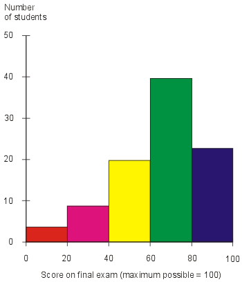
A histogram is a graphical display of tabulated frequencies, shown as bars. The graph I found shows a number of students and what they recieved on the final exam. Man, I hope I can be in the blue bar!! I found it here http://media.techtarget.com/digitalguide/images/Misc/iw_histogram.gif

Parallel coordinate graph


A parallel coordinate graph is used to plot large multivariate datasets. Each variable in the data plot is represented as its own Y Axis on the graph. A maximum point for each Y axis is selected, and they are scaled relatively to each other so that each variable takes up the same area in the graph space. The one I found shows baseball statistics. I found it here http://www.matthewtavares.com/baseball_report/graph_allteams.bmp